Windows ClearType makes Droid Sans look worse

TypeKit have recently posted a piece about font rendering in various browsers/operating systems that has inspired me to investigate something I'd noticed recently.
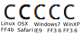
This blog uses Droid Sans for the headings. On Linux and OS X, this looks fine, as does Windows XP. On my Windows 7 machine however, it looks pretty horrible - the tops and bottoms of Cs are particularly bad, really jagged.
To work out why, I did rendered some test HTML using a couple of different fonts on several browsers. Here's an example, showing (from left to right)
- Firefox 4 beta on Linux (Fedora 11)
- Safari on OSX
- IE9 on Windows 7
- Firefox 3.6.11 on Windows 7
- Firefox 3.6.11 on a MacBook running Windows XP via Boot Camp

The four lines of text are. in turn:
- Helvetica/Arial/sans-serif lower case
- Helvetica/Arial/sans-serif upper case
- Droid Sans lower case
- Droid Sans upper case
(There's no difference between IE9 beta and Firefox 3.6.11 on Windows 7 in the image above, that I can see, but apparently they should be using different rendering technologies.)
The root cause turns out to be the different font rendering technologies used in various versions of Windows:
- XP defaults to "Standard", which is regular anti-aliasing, with options for ClearType (sub-pixel rendering) or no aliasing at all (the latter being really horrible to look at.)
- Win7 gives a choice of ClearType being on or off. Turning it off seems to be the same as "Standard" in XP, although I'm not 100% certain on that
Arial looks better in Win7 with ClearType on, as does the Windows "system" font, so I wonder whether there's an issue with hinting, and/or font designers tweaking fonts to best cater for the underlying font technology?
On other thing that might be worth mentioning, if you're playing with the font rendering in Windows, various browsers react differently when you change the settings:
| Firefox, Opera | Change takes effect instantly |
| Chrome/Iron | Change takes effect when page is refreshed |
| Safari | Change takes effect when browser is restarted |
| IE9 | No change - you are stuck with ClearType/DirectWrite, whether you like it or not |