What's the best way of including SVGs in a responsive web page?
TL; DR: <object> seems the best bet - although Safari 5.1 has issues compared to the other browsers. Second choice is having the SVG inline in the HTML, but that has issues for WebKit and IE.
As a diversion from my more usual diet of Python, I've spent a fair bit of time over the past week or so revisiting SVG. My previous experiments have usually been done using fixed sizes, but I've always wanted to do something that fits in better with what these days is called "responsive design", especially given as these are supposed to be scalable vector graphics.
For an example of the sort of thing I've been aiming for, take a look at the main chart on a Google Finance page. This Flash chart resizes horizontally as you change the size of the browser window. (NB: the chart makes extra data visible as you make the browser window wider, which isn't exactly what I want, but you should get the idea.)
Unless I've been particularly boneheaded about the way I've investigated this, this isn't as straightforward a problem as it first seemed. If you put a regular bitmap image in an HTML page with something like <img src="whatever.png" width="100%" /> the image will scale as you'd hope when the browser window is resized. This isn't necessarily the case with SVG.
As outlined in the W3C docs, there are five ways that you can pull SVGs into a page in a modern browser:
- <embed>
- <frame> / <iframe>
- <object>
- <img>
- Inline <svg>
I've built tests for each of these, and run them through the latest versions of the five main browsers. This obviously ignores a lot of issues with older browsers and mobile browsers, many of which don't even support SVG at all, but as it turns out, the "big 5" are enough to worry about on their own :-(
In the following sections, when I refer to a particular browser, the tests were done in the following versions, which (AFAIK) are the current ones as of early April 2012:
- Firefox 10
- Opera 11.62
- Chromium 17 or 19 (I didn't notice any difference between the two
- Internet Explorer 9
- Safari 5.1
Just for clarity's sake: all of this messing around is (probably?) only needed if you want an SVG to be scalable within your web page. If you're happy for it to be a fixed size, then you shouldn't have to worry about any of the following stuff.
<embed>
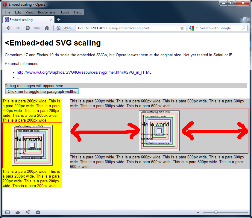
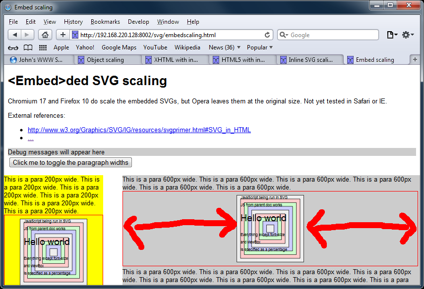
Test link: http://js-test.appspot.com/svg/embedscaling.html
The image gets scaled correctly in Firefox, Chromium and IE. The image does not get scaled correctly in Opera or Safari.
<iframe>
Test link: http://js-test.appspot.com/svg/iframescaling.html
(I've assumed <frame>s behave the same; I couldn't be bothered to write a separate test for them.)
Only Chromium rendered the page completely as desired.
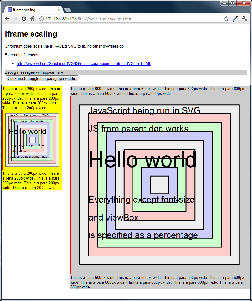
IE and Safari both failed to scale the images properly, but were able to modify the SVGs from the enclosing document's JavaScript.


Firefox and Opera failed to scale the images, or modify them via the JavaScript in the enclosing document. I'm not sure if the JS issue is down to some DOM API difference and/or security problem - but as the scaling is broken, I couldn't be bothered to investigate further.


(All browsers did at least run the JavaScript contained within the SVG files.)
<object>
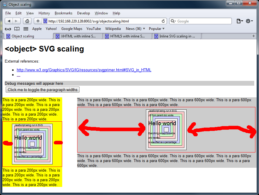
Test link: http://js-test.appspot.com/svg/objectscaling.html
Only Safari lets the side down, by failing to scale the SVGs. All other browsers work as desired.
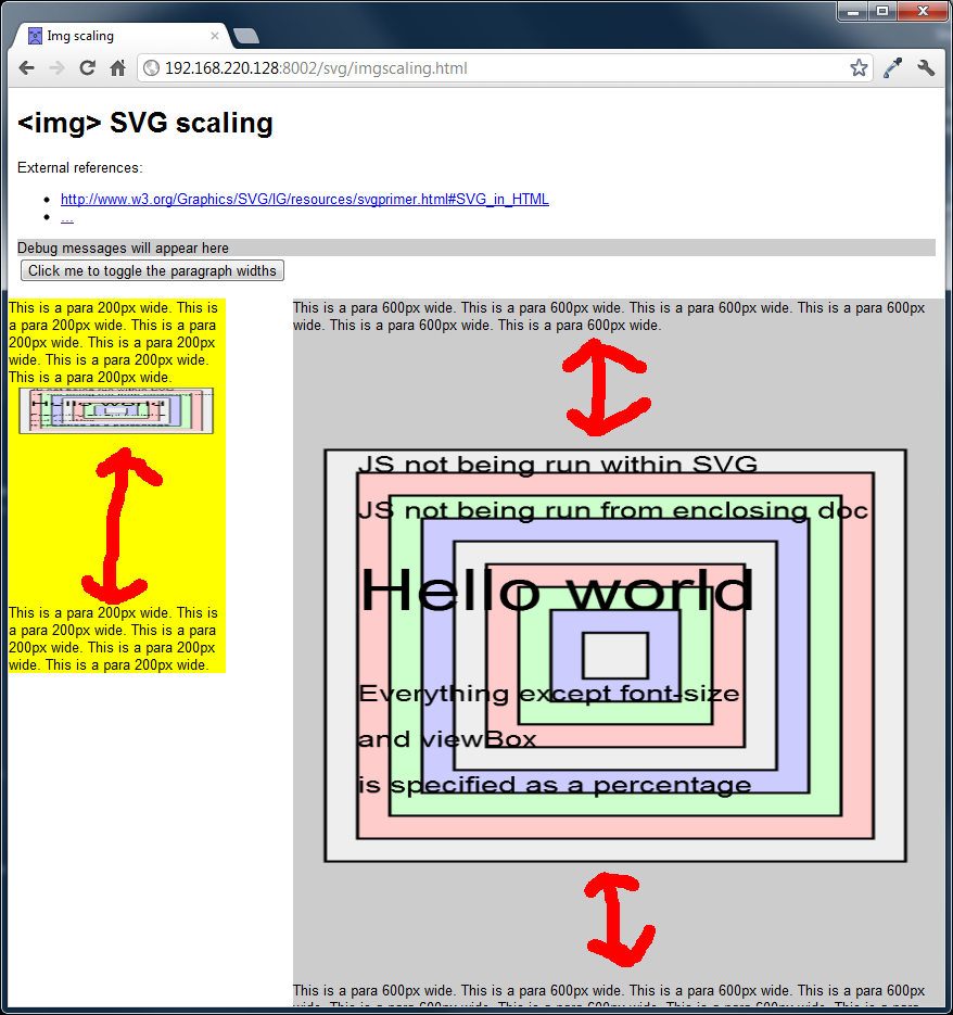
<img>
Test link: http://js-test.appspot.com/svg/imgscaling.html
If you have any JavaScript-based interactivity, forget about using <img> tags - the JS in the SVGs won't be run, and the JS in the document doesn't do anything either. WebKit-based browsers also have weird issues with additional padding and squashed images. You might hope that the preserveAspectRatio might be able to solve that, but I was unable to find any value which fixed things.

Inline <svg>
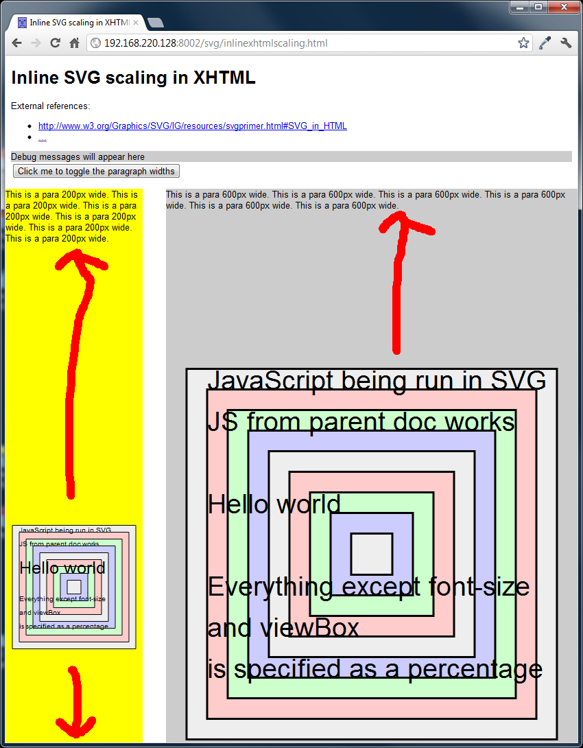
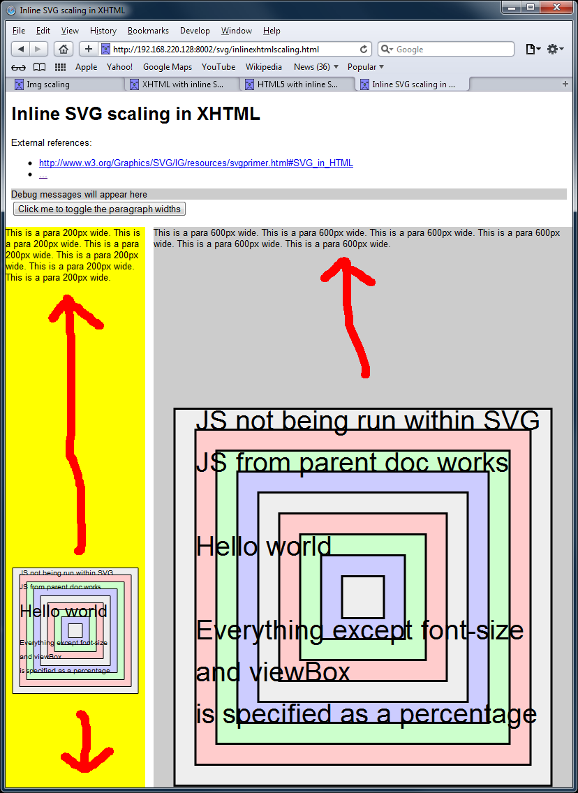
Test link: http://js-test.appspot.com/svg/inlinexhtmlscaling.html
This method is what the BBC uses for the position chart in its football tables, which is the highest profile use of SVG in a mainstream site that I know of.
Scaling works in all browsers, except IE.

However, WebKit browsers suffer from excessive vertical padding - it seems that WebKit assumes the height of the image is the same as the browser window, rather than the viewBox attribute in the <svg>. A slightly messy fix is to manually alter the height of the SVG elements after the page has loaded - this wasn't incorporated into this particular test, but an example from another test is here, and other people have documented similar workarounds. There are some open bugs on the WebKit tracker that might be related, here and here.
Whilst doing some earlier tests in this area, I also found a couple of bugs in Opera where
- An HTML5 page wouldn't properly render, and would never trigger the load event - but an effectively identical XHTML page was fine. Warning: this bug also causes Opera to consume 100% CPU on the processor it is running on

- If a page had multiple copies of the same SVG pulled in via the <img> tag, then if the page was reloaded, most of the duplicates would not appear:

Summary
As can be seen, of the five methods available, none is 100% foolproof. It seems to me that the best bet is <object>, as it works fine on all browsers except Safari, without need for JavaScript hacks. Second-place is embedding the SVG into the HTML, which entails a simple hack for WebKit browsers - but unfortunately is still broken in IE.